I’ve a problem with ionic version 7. In the new version in ion-input “helper” slot has been deprecated in favor of using the “helperText” property on ion-input or ion-textarea.
With the following code i’ve two underline with different dimensions. I think is a bug of the new version:
<ion-item>
    <ion-input type="text" label="{{ 'label.backend-url' | translate }}" labelPlacement="floating"
                  name="backendUrl" [(ngModel)]="backendUrl" helperText="{{ 'label.backend-url-help' | translate }}" >
     </ion-input>
</ion-item>
If i remove the lines on ion-item i have:
<ion-item lines="none">
     <ion-input type="text" label="{{ 'label.backend-url' | translate }}" labelPlacement="floating"
                  name="backendUrl" [(ngModel)]="backendUrl" helperText="{{ 'label.backend-url-help' | translate }}" >
     </ion-input>
</ion-item>
But the line width has not the same length as the one of ion-item.
I found a solution → remove the item, but the underline is bigger than normal, and sometime i’ve not all fields with an helper text.
I think that helper slot should not have been deprecated because with the new strategy doesn’t work if the helperText is dynamic because the line is shown only when helperText is not undefined. So the apperance of the input line is broken
Work around. Two inputs one with helper text and other without
<ion-item lines="none">
    <ion-input type="text" label="First name" labelPlacement="floating"
        name="backendUrl" helperText="second helperText" >
    </ion-input>
  </ion-item>

<ion-item lines="none">
  <ion-input type="text" label="Last name" labelPlacement="floating"
      name="backendUrl"  >
  </ion-input>
</ion-item>
In global.scss
.native-wrapper
{
border-bottom:solid 1px lightgray;
}
For Ionic 7 /// Ionic 7 Inline Alert custom styles - YouTube
So we are looking to add more guidance on this soon, but the short answer is you should not use helperText/errorText on an input inside of ion-item. However, helperText/errorText can be used on inputs that are not used inside of list/item views.
We have not been very clear about best practices surrounding items/lists in the past, and it’s something we are looking to do better with.
Instead, I recommend using ion-note below the list to clarify the intent of the input. Here is an example:
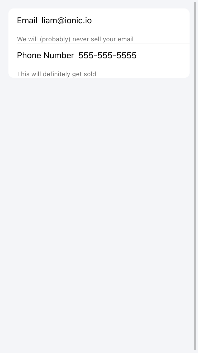
Incorrect Usage:
This examples uses helperText on an input inside of an item. Note the double border as mentioned previously.
Correct Usage:
This is using an ion-note below each list to clarify the inputs.
2 Likes
There is a way in the new version 7.02 to make the line below always visible also if the input has not an helperText ?
Because if i use the input without item the line is present only in ion-input where helperText is set. But i’ve not this helperText on all fields
<ion-input type="text" label="{{ 'label.name' | translate }}" labelPlacement="stacked"
          name="name" [(ngModel)]="name" maxlength="50">
  </ion-input>
I’ve used fill=“solid” property but it changes also the style of input.
As workaround i’ve added css:
ion-input {
border-bottom: 1px solid #e4e4e4;
}
But i think that can be useful a property like the one present in ion-item (lines=‘full’) to show the line without css