I am upgrading to v7 and the input usage has changed. In this section of the docs ion-input: Custom Input Value Type Styling and CSS Properties it says:
<!--
  Metadata such as counters and helper text should not
  be used when an input is in an item/list. If you need to
  provide more context on a input, consider using an ion-note
  underneath the ion-list.
-->
However, the helper and error slots are deprecated on an ion-item. Is there an intended way of providing helper and error text for a specific input when using inputs within ion-item?
So we are looking to add more guidance on this soon, but the short answer is you should not use helperText/errorText on an input inside of ion-item. However, helperText/errorText can be used on inputs that are not used inside of list/item views.
We have not been very clear about best practices surrounding items/lists in the past, and it’s something we are looking to do better with.
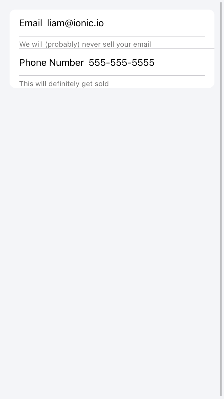
Instead, I recommend using ion-note below the list to clarify the intent of the input. Here is an example:
Incorrect Usage:
This examples uses helperText on an input inside of an item. Note the double border as mentioned previously.
Correct Usage:
This is using an ion-note below each list to clarify the inputs.
1 Like
Almost all the guidance on inputs is within a list and the ion-item element. If one wants to use helper and error text (or counters), it has to be outside the list. But there isn’t consistency with underlining to create a consistent form this way. If I want some inputs with helper text, and some without, is that possible? Essentially I need to force the underline that is created through the helper text or input counter to appear regardless. Because right now the inputs without some helper text have no underline and are visually inconsistent. Inputs are frequently used together in a form so that seems useful.