@mhartington… Mine is a hybrid app which works on iOS and Android both.
Now with your solution it doesn’t work with iOS.
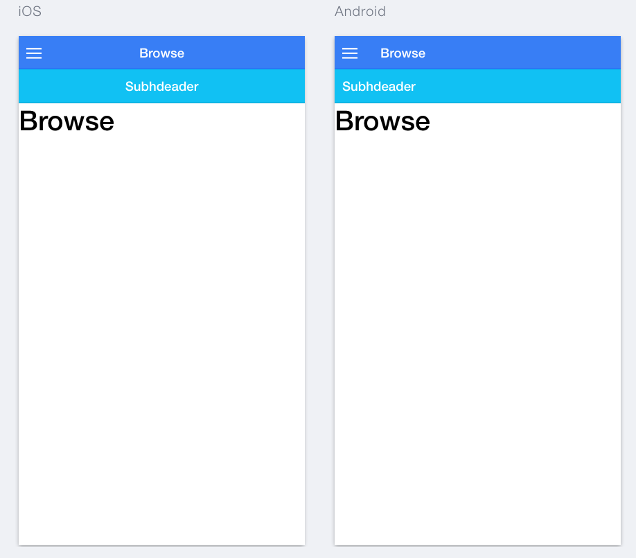
It leaves a gap in between the header and the subheader in iOS.
The fix should be something with a conditional logic for iOS and Android.
I am not a CSS expert, but from what I can gather the spacing should vary depending on the platform.
Please help.
P.S:- An example is the Footer, which automatically adjusts well between iOS and Android.
It is in fact my temporary savior as meanwhile I have moved my sub-headers to footer.
So this way, the css will only be applied on android. During the build process, we modify the index.html to include a class of platform-ios or platform-android.
@mhartington
Ideally your solution should work only when I have tabs and not shift it down when I am dealing with non-tabs screen.
But its strange that it is still shifting it down even when there is no tab.
So, can you please recheck the above pasted code.
Secondly, I think this should be fixed in the ionic framework itself as it is a bug, and not solved locally in the developers side. Please confirm if this is the correct understanding.
Can you please have a look at this link?
I hope it shows up. As you can see there is no tab above the sub-header, yet it is showing below and there is an awkward space and the sub-header is actually floating.
Codepen I am not sure as it wont detect the platform.
I am new to Ionic and I have the same problem, plus I’m using SASS instead of the style.css
[EDIT] : adding the two snippets to .scss didn’t help (nothing changed).
I’m still seeing this problem as well. Ionic v1.0 boilerplate tabs starter project with bar-subheader added. Looks fine on IOS but subheader gets hidden behind (top-positioned) tabs on Android. Any pointers? I can “fix” this by pushing the tabs to the bottom of the screen (IOS-style) but I’d really rather not.
(Turns out if I push the tabs to the bottom of the screen on Android I run into another Ionic 1.0.0 bug: the soft keyboard doesn’t hide the tabs when it slides up, it just pushes them up, severely limiting the input view. I’ve seen this mentioned other places on the forum)
Hi guys,
I found another trick to solve this problem.
What I did is add a extra class in .bar-subheader (lets say .bar-custom) then just added this following CSS in style.css file.