I am building an app with ionic-v4 vanilla javascript. I require it as the documentation says.
<script src="https://unpkg.com/@ionic/core@latest/dist/ionic.js"></script>
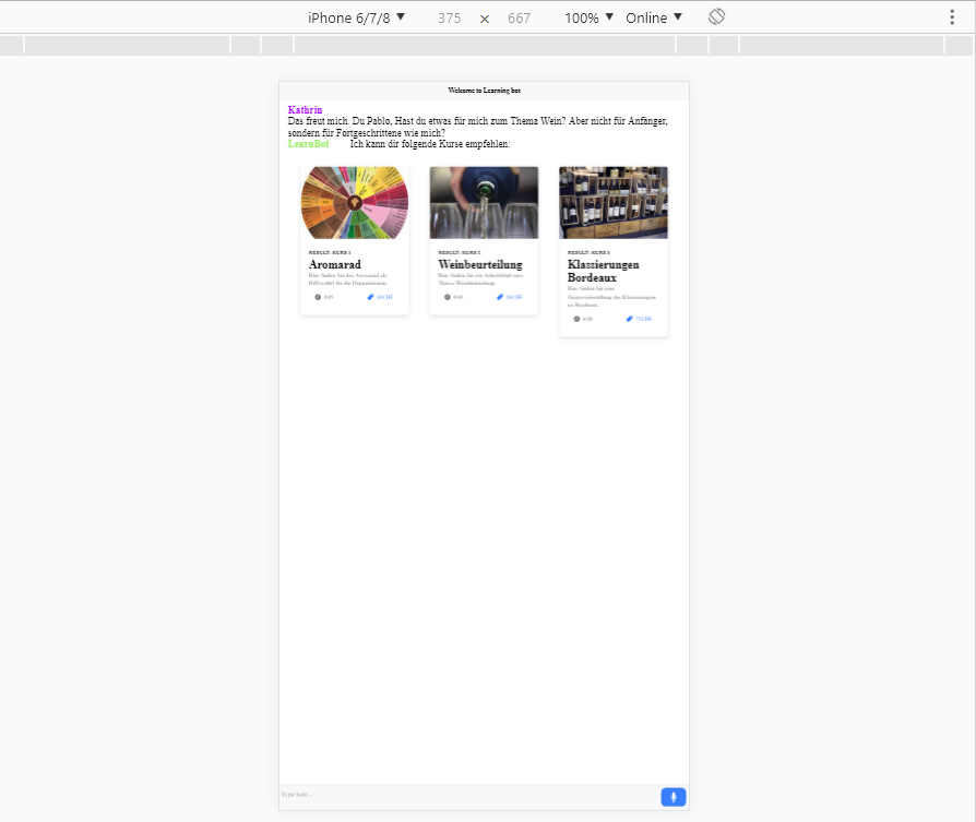
Everything works fine in the browser, the only problem is when I switch to mobile view it does not adapt and all fonts and buttons are super small. Is there some special setting I have to enable to make it responsive?
To answer my own question. I had to push meta tags in the index.html file
  <meta name="viewport" content="viewport-fit=cover, width=device-width, initial-scale=1.0, minimum-scale=1.0, maximum-scale=1.0, user-scalable=no">
  <meta name="description" content="">
  <meta name="theme-color" content="#16161d">

  <meta name="format-detection" content="telephone=no">
  <meta name="msapplication-tap-highlight" content="no">

  <meta name="apple-mobile-web-app-capable" content="yes">
  <meta name="apple-mobile-web-app-title" content="">
  <meta name="apple-mobile-web-app-status-bar-style" content="black">

  <meta http-equiv="x-ua-compatible" content="IE=Edge">
Now it looks ok 
Thank you! Been trying to track down for an hour, and this was the fix I needed.