I am creating a hybrid app with Ionic 4.
I use css media queries to do specific layouts according to the screen size mobile is needed. Example:
This how it looks my app in a viewport of 360x640 screen size pixels in browser:
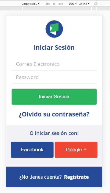
But, this how it looks in my cellphone which have the same screen size (360x640) in pixels:

All the blue part is cut off of the screen.
here is the css:
@media screen and (max-height: 640px) {


.ultraipunt{
    font-size:19px;
}

.tittle{
  font-size: 23px;
}

.tittle3{
  font-size: 19px;
}

.buttonclass{
    font-size:19px;
    height:60px;
}

.buttonfacebook{
    font-size:19px;
    height:60px;
}

.buttongoogle{
    font-size:19px;
    height:60px;
}

.fond1{
   min-height: 154px;
}

.fond2{
   padding-top:0.5em;
  padding-bottom:0.5em;
  margin-top:0px;
}
.textwhite {
    font-size:18px;
}
.textwhitebold {
    font-size:18px;
}

form{
    margin-bottom:0em;
    margin-top:0em;
}

.imgen1{
 width:65px;
}


}
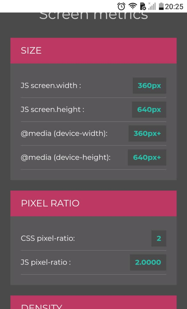
Using the site: https://www.mydevice.io/, this are my cellphone specifications:
Now my questions are:
Why the css sizes are no translating well to my cellphone viewport? How can I do responsive design with ionic 4 for hybrid app?