I want to design a responsive design. But i can't able to do

I want to design a responsive design. But i can’t able to do
below my html

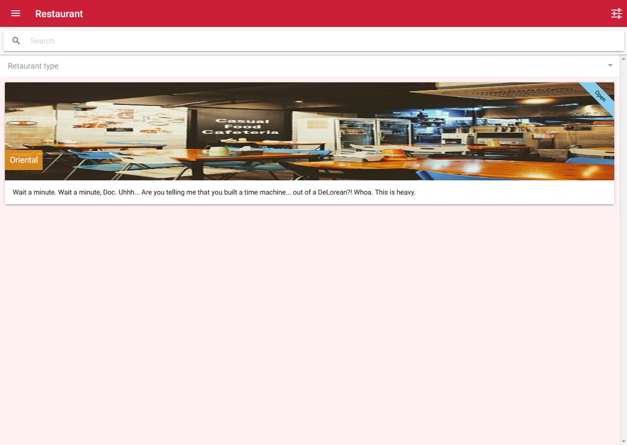
<ion-card class="res-card">
<span class="open">Open</span>
  <img  class="img-size" src="https://cde.peru.com//ima/0/1/6/3/2/1632689/611x458/50-best-restaurants.jpg">
  <span class="card-img-price">Oriental</span>
  <ion-card-content>
    <p>Wait a minute. Wait a minute, Doc. Uhhh... Are you telling me that you built a time machine... out of a DeLorean?! Whoa. This is heavy.</p>
  </ion-card-content>
</ion-card>

.css

page-restaurant-list {
.bg-color{
	background-color: #fff0f2;
}
.res-card{

	//border-radius: 5px;
	position: relative;

}
.open {
	background: skyblue;
	width: 120px;
	font-size: 1.15rem;
	position: absolute;
	-webkit-transform: rotate(45deg);
	transform: rotate(45deg);
	padding-top: .5rem;
	padding-bottom: .5rem;
	top: 16px;
	right: -32px;
	z-index: 999;
	overflow: hidden;
	text-align: center;
}
.img-size{

	height: 200px;
}
.res-card .card-img-price {
	color: #fff;
	font-size: 1.65rem;
	position: absolute;
	bottom:28%;
	left: 0;
	background-color: rgba(255,158,33,.8);
	padding: 1rem;
	border-radius: 0 4px 0 0;
}
.fw700 {
	font-weight: 700 !important;
}
}

Mobile view
look like this

Full screen view


But i iwant to design look like this

how can i do that please help me anyone.
Thanks

Maybe you can put that cards in a grid. There is a blog post about it here:
https://blog.ionicframework.com/customizing-ionic-apps-for-web-mobile/

I did not get solution. actually am new in design please help me

You did not really Point out what it should look like on a Desktop Screen.

You can do it that way:

import { Component } from '@angular/core';
import { NavController } from 'ionic-angular';

@Component({
  selector: 'page-home',
  template: `
    <ion-header>
      <ion-navbar>
        <ion-title>Home</ion-title>
      </ion-navbar>
    </ion-header>

    <ion-content>
      <ion-grid>
        <ion-row>
          <ion-col *ngFor="let card of myCards" col-12 col-xl-2 col-lg-3 col-md-4 col-sm-5>
            <ion-card>
              <img [src]="card.img" />
              <ion-card-header>{{ card.title }}</ion-card-header>
              <ion-card-content>{{ card.content }}</ion-card-content>
            </ion-card>
          </ion-col>
        </ion-row>
      </ion-grid>
    </ion-content>
  `,
  styles: [`
    page-home {
      @media (max-width: 576px) {
        ion-card-content {
          font-size: 2rem !important;
        }
      }

      @media (max-width: 820px) {
        .mobile-fab {
          display: none;
        }
      }

      @media (min-width: 820px) {
        .web-fab {
          display: none;
        }
      }
    }
  `]
})
export class HomePage {
  myCards = [
    {
      img: 'https://loremflickr.com/100/100',
      title: 'Card 1',
      content: 'Lorem ipsum dolor sit amet, consetetur sadipscing elitr, sed diam nonumy eirmod tempor invidunt ut labore et dolore magna aliquyam erat, sed diam voluptua. At vero eos et accusam et'
    }, {
      img: 'https://loremflickr.com/99/99',
      title: 'Card 2',
      content: 'Lorem ipsum dolor sit amet, consetetur sadipscing elitr, sed diam nonumy eirmod tempor invidunt ut labore et dolore magna aliquyam erat, sed diam voluptua. At vero eos et accusam et'
    }, {
      img: 'https://loremflickr.com/98/98',
      title: 'Card 3',
      content: 'Lorem ipsum dolor sit amet, consetetur sadipscing elitr, sed diam nonumy eirmod tempor invidunt ut labore et dolore magna aliquyam erat, sed diam voluptua. At vero eos et accusam et'
    }, {
      img: 'https://loremflickr.com/97/97',
      title: 'Card 4',
      content: 'Lorem ipsum dolor sit amet, consetetur sadipscing elitr, sed diam nonumy eirmod tempor invidunt ut labore et dolore magna aliquyam erat, sed diam voluptua. At vero eos et accusam et'
    }, {
      img: 'https://loremflickr.com/96/96',
      title: 'Card 5',
      content: 'Lorem ipsum dolor sit amet, consetetur sadipscing elitr, sed diam nonumy eirmod tempor invidunt ut labore et dolore magna aliquyam erat, sed diam voluptua. At vero eos et accusam et'
    }
  ]
  constructor(public navCtrl: NavController) { }
}

When you increase the width you get more cards in one row.

Only the app:
https://ionic-forum-6.stackblitz.io

Oh ho I’m really sorry this oriental bloke
I want exactly the same block that is there.

You can also do something like this:

    <ion-header>
      <ion-navbar>
        <ion-title>Cats</ion-title>
      </ion-navbar>
    </ion-header>
    <ion-content>
      <ion-grid>
        <ion-row *ngFor="let card of myCards">
        <ion-col col-0 col-xl-4 col-lg-3 col-md-2 col-sm-1></ion-col>
          <ion-col col-12 col-xl-4 col-lg-6 col-md-8 col-sm-10>
            <ion-card>
              <img [src]="card.img" />
              <ion-card-header>{{ card.title }}</ion-card-header>
              <ion-card-content>{{ card.content }}</ion-card-content>
            </ion-card>
          </ion-col>
          <ion-col col-0 col-xl-4 col-lg-3 col-md-2 col-sm-1></ion-col>
        </ion-row>
      </ion-grid>
    </ion-content>

Yesterday there was published a great blog post regarding ionic apps for desktop usage. Maybe that is what you are looking for:
https://blog.ionicframework.com/tips-tricks-for-ionic-on-desktop/