Hello,
I used the mobile accessibility plugin to disable the font size from the device.
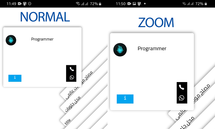
So user will change the font size from the device it will not reflect in the app. But if the user change the display size then the code is not working which we used and change of display size is effecting the app.
When using LARGE Screen Zoom and Normal Font Size in the Settings of this Android phone and using the same process shown in the video above in the first post, I am getting the same error with the screen rotation and the right side of the screen getting cut off.
The following are screenshots of the phone font and display settings and what it looks like when the screen is cut off.


