Hi, I make some input box use ion-grid,
by the way, when I use the phone keyboard, the screen distorted like picture
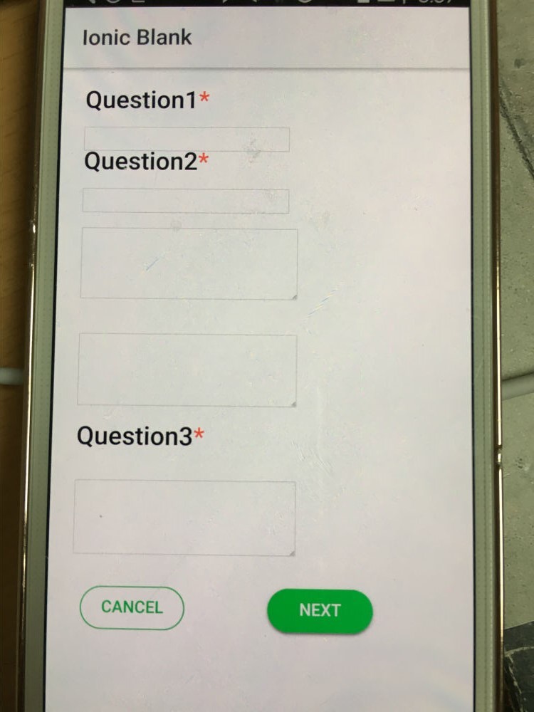
I want the keyboard to cover the screen without distorting it.
and
I want to match the grid to the phone resolution.
If you have a good idea, please help me
it’ my code
html
> <ion-grid>
>       <ion-row >
>         <h3>Question1<span color="danger">*</span></h3>
>       </ion-row>
>       <ion-row >
>         <input type="text" value="" />
>       </ion-row>
>       <ion-row >
>         <h3>Question2<span color="danger">*</span></h3>
>       </ion-row>
>       <ion-row >
>         <input type="text" value="" />
>       </ion-row>
>       <ion-row >
>         <ion-item no-lines no-padding>
>           <textarea id="myInput" rows="3" maxLength="500"></textarea>
>         </ion-item>
>       </ion-row>
>       <ion-row >
>         <ion-item no-lines no-padding>
>           <textarea id="myInput" rows="3" maxLength="500"></textarea>
>         </ion-item>
>       </ion-row>
>       <ion-row >
>         <h3>Question3<span color="danger">*</span></h3>
>       </ion-row>
>       <ion-row >
>         <ion-item no-lines no-padding>
>           <textarea id="myInput" rows="3" maxLength="500"></textarea>
>         </ion-item>
>       </ion-row>
>       <ion-row>
>         <ion-col width-50>
>           <button ion-button round outline color="secondary" class="btn" >cancel</button>
>         </ion-col>
>         <ion-col width-50>
>           <button ion-button round color="secondary" class="btn" >next</button>
>         </ion-col>
>       </ion-row>
>   </ion-grid>
scss
.btn {
  width: 60%;
}
ion-row {
  width: 100%;
}
ion-grid{
  height: 100%;
}