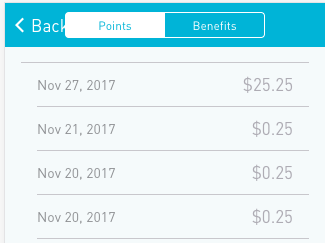
When running on an actual iPhone SE, my <ion-segment> is getting cut off so only the top half of the segment is showing.

Here is my code:
<ion-header>
  <ion-navbar>
    <ion-toolbar>
      <ion-segment [(ngModel)]="topTab" color="primary">
        <ion-segment-button value="points">
          Points
        </ion-segment-button>
        <ion-segment-button value="benefits">
          Benefits
        </ion-segment-button>
      </ion-segment>
    </ion-toolbar>
  </ion-navbar>
</ion-header>
I was also able to replicate this issue on an iPhone 7 emulator and an iPhone 7 Plus emulator. On Android, this is not an issue.
Does anyone have a fix for this?
What I’m going to do until I find a better way is remove the <ion-nav> and add a button in the toolbar for navigating back:
<ion-header>
  <ion-toolbar>
    <ion-buttons left>
      <button ion-button icon-only navPop>
        <ion-icon name="arrow-back"></ion-icon>
      </button>
    </ion-buttons>
    <ion-segment [(ngModel)]="topTab" color="primary">
      <ion-segment-button value="points">
        Points
      </ion-segment-button>
      <ion-segment-button value="benefits">
        Benefits
      </ion-segment-button>
    </ion-segment>
  </ion-toolbar>
</ion-header>
Unfortunately this creates an inconsistent UI because all of the other pages say Back on iOS. If I change the button so that it is not icon-only and I add the text Back to the button, then part of that text gets overlapped by the segment.