Hi, I’m trying to use this on one of my pages:
<ion-content padding class="groups-list">
<ion-row wrap>
<ion-col>
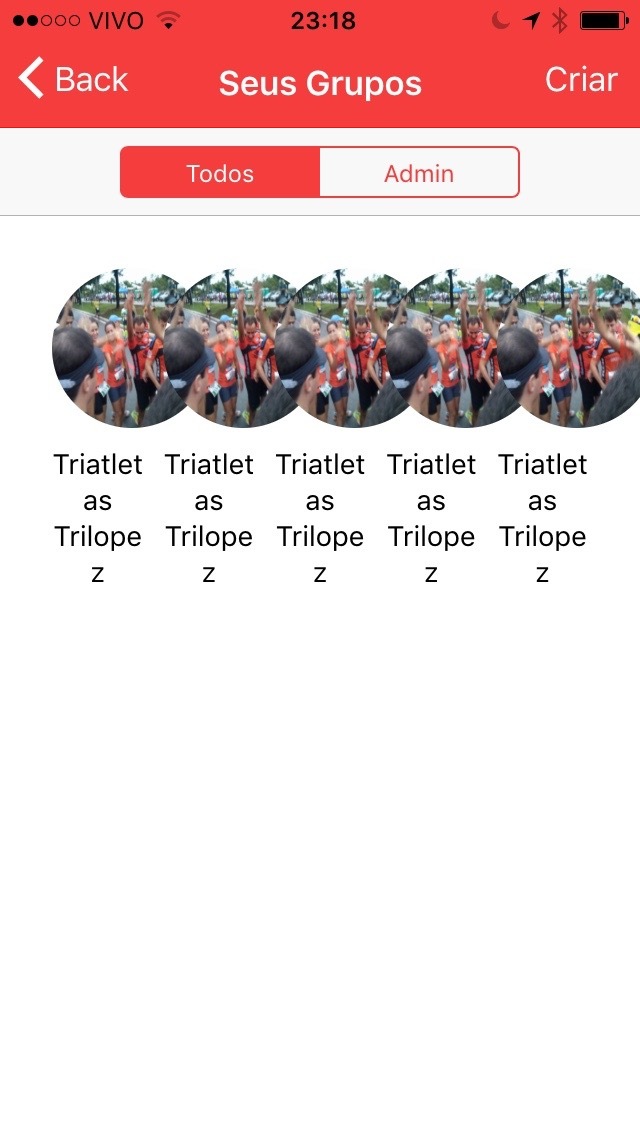
<img src="img/group01.jpg" class="group-icon" />
<p class="group-name" text-center>Triatletas Trilopez</p>
</ion-col>
<ion-col>
<img src="img/group01.jpg" class="group-icon" />
<p class="group-name" text-center>Triatletas Trilopez</p>
</ion-col>
<ion-col>
<img src="img/group01.jpg" class="group-icon" />
<p class="group-name" text-center>Triatletas Trilopez</p>
</ion-col>
<ion-col>
<img src="img/group01.jpg" class="group-icon" />
<p class="group-name" text-center>Triatletas Trilopez</p>
</ion-col>
<ion-col>
<img src="img/group01.jpg" class="group-icon" />
<p class="group-name" text-center>Triatletas Trilopez</p>
</ion-col>
</ion-row>
</ion-content>
According documentation the “wrap” attribute on ion-row is supose to wrap the cols as needed.
But this doesn’t happen on iOS devices neither on emulator.
Am I doing something wrong? Is that a bug?
Thanks!
1 Like
In this case, this is the expected behavior, though it’s easy to assume why something could be wrong.
So ion-col default flex value is to just take up as much space as there is available.
If there’s 3 items, it will take 33% of the width.
But it’s important to remember that there is not fixed width on it.
So 5 items with not set width with still try to fit into one row, even if it has wrap applied to it.
You need to specify a width for the ion-col in order for wrap to work.
Hi Mike, thanks for reply.
Unfortunately it didn’t work. Your answer makes a lot of sense but on emulator and on device it doesn’t work.
I set width on ion-col as you said, set max and min width too, but it’s looks like this on emulator and on device as well:
Here is the property width set and working pretty well on browser.
Any thoughts?
Thanks!
I have this as well, wrap atttribute works well in browser and I get a grid as expected. In simulator or on the device without width on the col all cram onto one line, with min-width on the col the row just runs off the edge of the screen and doesn’t wrap.
I found a solution to this, and it’s probably something that could be incorporated into the default CSS.
If you use a col with a width value (ie col width-25) then the wrap property on the row works exactly as expected, but this really doesn’t give you much flexibility to handle different screen sizes and orientations.
if you do not use a pre-defined width value on the col and instead set min-width:100px for example then wrap does NOT work on iOS or in safari, but works fine in Chrome and on Android.
If you edit your CSS with the below where the last value is your desire min-width then wrap works perfectly on iOS and safari.
I would suggest adding into the default Ionic CSS that if a min-width is set then add the 3rd value to the flex CSS. This could also be added into the docs for Grid for scenarios where you want a minimum size to an item but otherwise want them to expand to fill the available space evenly without a fixed number of items per row.
ion-col{
flex: 1 0 100px;
}
it seems like safari / ios don’t like having auto as the 3rd value which is what you get currently without having a fixed column width, whereas Chrome will use auto correctly. This change just makes behaviour consistent and delivers a wrap as expected on safari so long as you have a min-width set.
@mhartington - any chance of something like this making into the default ionic CSS?
1 Like
the problem with this solution is that it will break views on big screens. A row will always fill 100% of the screen, which is not the desired effect. I have not yet found a way to avoid defining a certain width for an element, but I have found a css ‘fix’ that allows you to at least have a consistent look on mobile and tablets vs. browsers
/*fix for ios*/
@media (max-width: 476px) {
    ion-content.content-ios{
       ion-row[wrap] {
           ion-col {
              flex-basis: 100%;
  }
 }
}
}
@media (max-width: 768px) {
  ion-content.content-ios{
     ion-row[wrap] {
        ion-col {
           flex-basis: 50%;
  }
}
}
}
I wrote a bit about it on medium , which helps visualising because of some screenshots
2 Likes
With my fix a row will always fill 100% but the col will be bound by the min-width for the col so it will just fit as many as it can on a row.and then wrap.
This means you always get a nice grid when screens are infinitely variable as they are with android where 4 might fit across on one device but part of the 4th item get cut off on some other model.
I could see a combination of the 2 potentially being good with a defined set of media queries that adjust the min width so that on larger screens the cols will be bigger but it will still fit as many as possible on each row. Which is important when you start having resizable windows and iPad pros and things.
The annoying thing is android and chrome browser this just works, it’s an iOS specific quirk that has existed since ionic v1 and seems to have been missed again even in the latest revision of the grid for ionic2 which is a pain with a mobile first framework.
+1 Having the same problem with mine too. My hacky fixing way is … to use regular row when run on ios…
        <!--
            We duplicate the grid and original ion-item because responsive
            grid doesn't work well with iOS yet.
            TODO(xinbenlv): remove this ion-list when works on iOS.
            See https://forum.ionicframework.com/t/ion-row-wrap-attribute-doesnt-work-on-ios-devices/50603/5
        -->
        <template *ngIf="!useGrid">
            <ion-item *ngFor="let imageId of listing.imageIds">
                <img src="{{ imageId | imageIdToUrlPipe:'full' }}" alt="img-{{imageId}}"
                     (click)="showImage(imageId)">
            </ion-item>
        </template>

        <ion-grid *ngIf="useGrid">
            <ion-row>
                <ion-col col-12 col-lg-3 col-md-4 col-sm-12 col-xs-12
                         *ngFor="let imageId of listing.imageIds">
                    <img src="{{ imageId | imageIdToUrlPipe:'full' }}" alt="img-{{imageId}}"
                         (click)="showImage(imageId)">
                </ion-col>
            </ion-row>
        </ion-grid>
If this issue can be fixed, the adoption of responsive grid will be much easier